
Mar 18th 2026
Rebuilding My Ancient Portfolio
Written by Dalton Wemer
How I Got Here:
I think alot about how to showcase the work that I spend 50+ hours a week on. How can I summerize the work that I have done over the last 10 years but package it in a clean and digestable package? How can I hype up my work for anyone who might want to bring me onto their team while still keeping the brands that I work for at the forefront?
While I had been slowly adding projects over time, the foundation of my portfolio hadn’t changed. The codebase I started in React V16 back in 2017 was no longer maintainable and didn’t reflect my current skillset.
So at the beginning of this year, I decided to rebuild everything from scratch using zero external dependencies and leaning heavily on the accessibility and performance practices I’ve developed while working on enterprise scale Next.js applications.
Approach to Launch
- Designed in Figma with a lightweight design system
- Rebuilt all assets from scratch
- Focused heavily on accessibility + performance
- Used modern Next.js with SSR-first mindset
- Shipped in under 2 weeks
The Thought Process
Most of the time spent on this project was in the design phase.
I wanted to create a personal brand that felt distinct, while still letting the brands I’ve worked with stand out. I landed on a floral white background to bring warmth to the site something softer and more inviting than a harsh white.
Branding
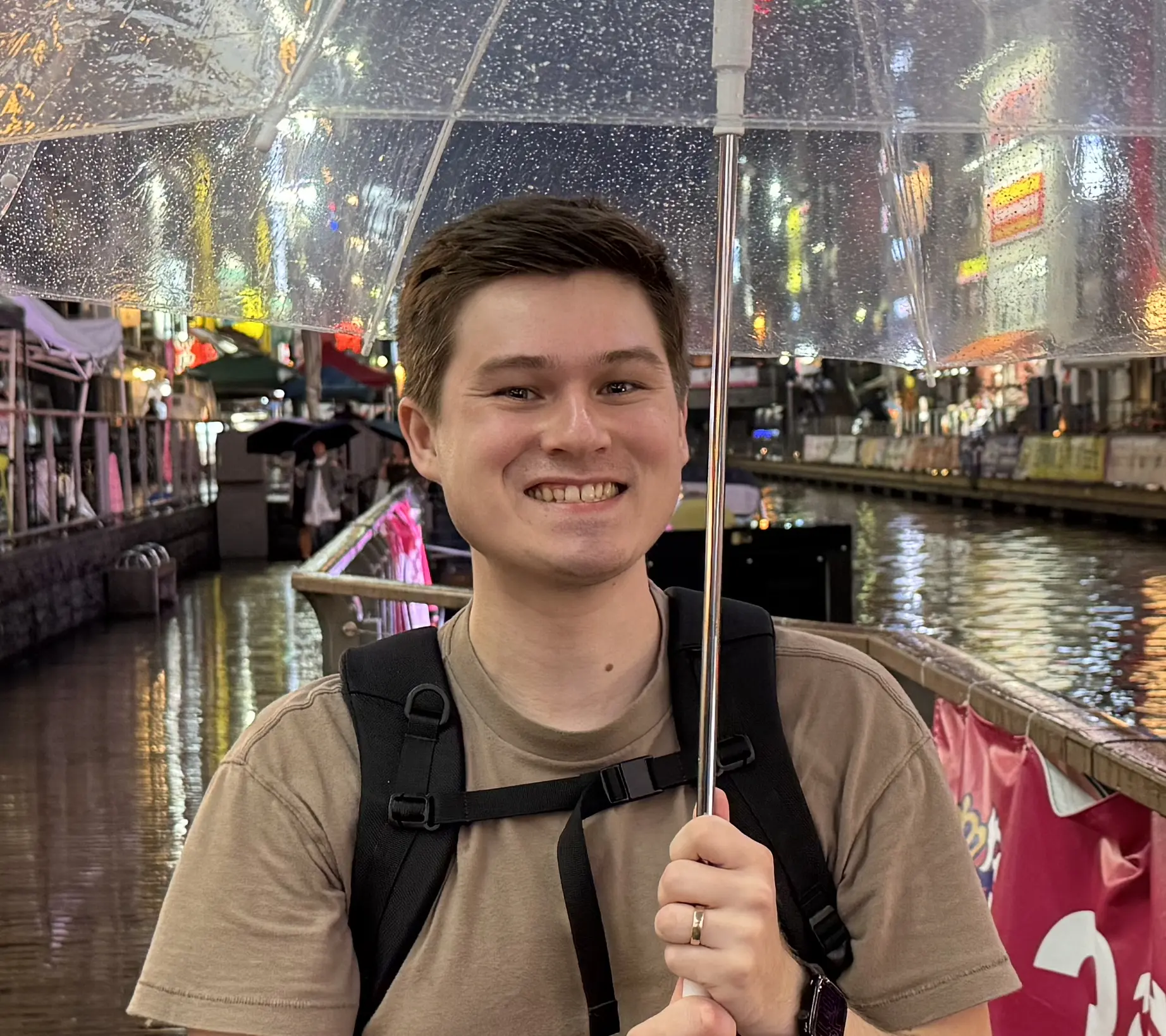
I want to make a picture of me on my one of my favorite trips as the hero image. The photo is of me in Dontonbori district of Osaka and the Neon lit river on a rainy October evening made the perfect backdrop for the vibe that I wanted to create for my portfolio. One of the colors found in that image is a striking Neon Pink (#FA3054). This made for an attention grabbing accent color to ground my brand that is distinct enough from the work that I have done in the past. This hero image helped create a visual identity for the rest of the site.
I then needed to create my first logo for myself. While expirementing with a ton of different designs I knew that I loved the font that Apple uses to onboard new users in MacOS with the "Hello" text. While Apple keeps that font a real secret I found a font that I like just as much called Borrel that evokes some of the same feeling, while not feeling like a knock-off.
Site Structure
My previous portfolio relied heavily on separate pages for each project. The problem was most users never clicked into them.
This time, I focused on making everything valuable at a glance.
Instead of showcasing every role I’ve had, I prioritized my most recent work and presented it through interactive carousels. Each card highlights my contributions and gives users the option to explore further if they’re interested.
To break up the layout, I introduced a few more expressive components:
Animated metrics to highlight high level impact A horizontally scrolling blog section with a weighty scroll based animation Variations in layout to avoid repetition
Development Begins
Animations are my favorite part of development, so I wanted to strike a balance between large, attention grabbing moments and subtle micro interactions.
Anything above the fold is server side rendered, which meant limiting client side logic early on. For lighter motion, I used CSS like a subtle ticker that cycles through technologies I’m currently using.
Further down the page, I introduced client side enhancements using an intersection observer hook. As sections enter the viewport, components animate into place—carousels expand, borders soften, and layouts become more dynamic.
I also built a custom horizontal scroll indicator that scales based on scroll position, giving users a better sense of progress through each carousel.
The most time consuming piece was the blog section animation—finding the right balance between weight, motion, and clarity took several iterations.
At the bottom of the page, I experimented with a scroll driven interaction (borderline scroll jacking). Instead of content moving past the user, it expands as they scroll. While this can introduce usability concerns, I treated it as a decorative section rather than core content.
Retrospective
This project reinforced a few things for me:
- Design takes significantly longer than development—and that’s a good thing
- Constraints (like avoiding dependencies) make decisions clearer
- Performance and accessibility should be built in from the start, not added later
- Shipping something complete is more valuable than endlessly polishing
Most importantly, this version of my portfolio finally feels like a reflection of how I build today not how I built years ago. While I know I will continue to add to and refine this project over the next few years I am feeling much better about it as a base to continue to add on to.